– Tom Goodwin, Head of Innovation, Zenith Media
It's all about the interface
If space is an interface which enables user activities, the boundary between virtual and physical space is increasingly blurred while some socio-physical interactions have been completely replaced by new digital paradigms.
How does this apply to architecture?
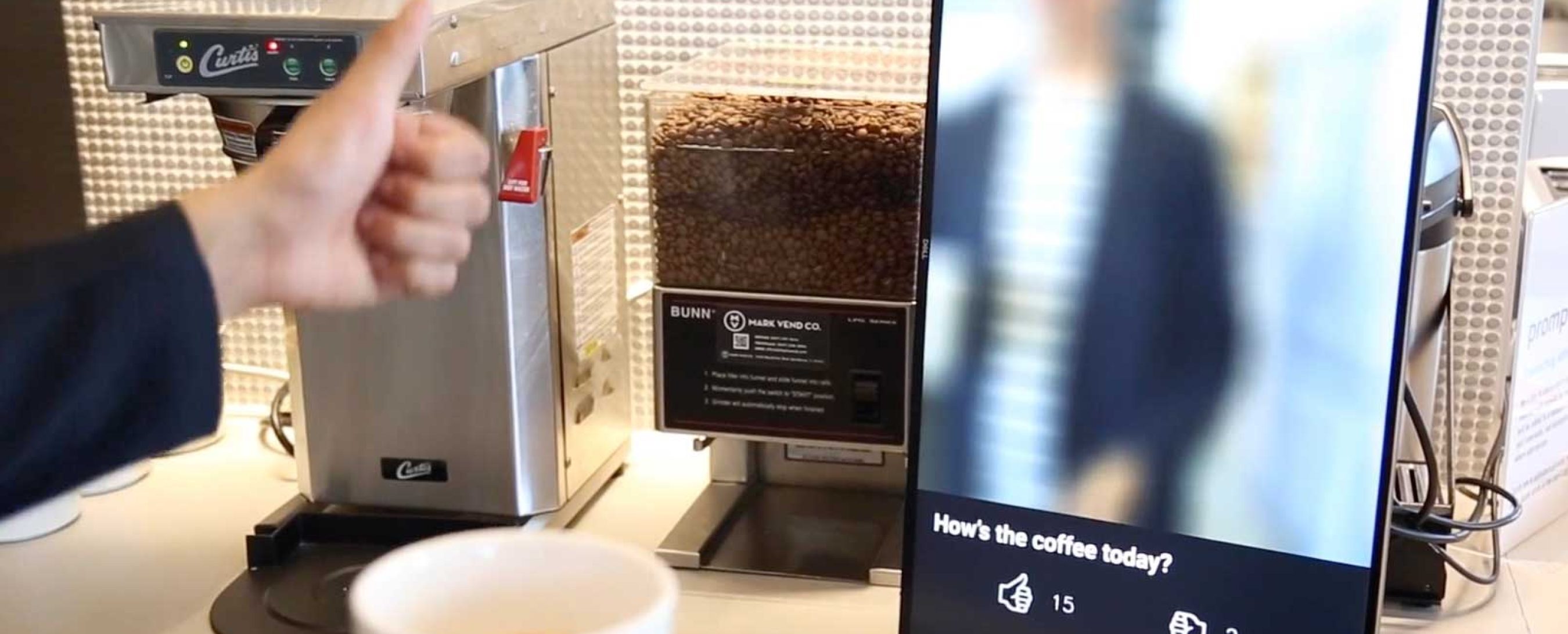
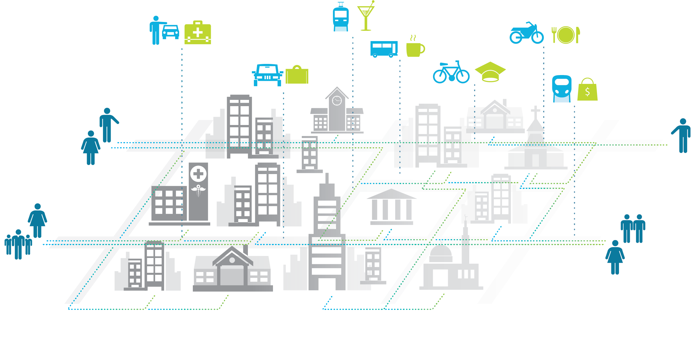
Architects and designers are very comfortable thinking of the way spaces enable users to engage in activities. Some spaces are highly mediated and tailored to specific uses while others are more flexible and open. Scale is another key property of the designed environment. Designers apply their skills to everything from the object to the room to the building and the city which contains all these individual elements many times over. However, the digital layer is transforming the way people interact with spaces at all scales. Taxi stands, information booths, queuing lines, concierge desks, receptions, and lobbies are all spaces which have been transformed by new digital tools and experience layers . Smart companies and brands are taking advantage of mobile apps and device location awareness to modify the experiences of their clients and users – both virtually and increasingly to augment interfaces in physical space.
The simplest and most visible impact of the digital layer is the modification of public spaces for more flexible uses. As personal technology becomes more powerful and ubiquitous, there are new infrastructure needs for power and connectivity. This also creates new challenges for privacy and sound modulation/isolation as people are engaging in different modes of behavior simultaneously. Instead of provisioning single-use spaces with specific technology and furniture groupings, public spaces are increasing multi-modal and flexible. This is only the first and most basic stage of transformation, however.
The changing spatial paradigm
The past decade has seen an incredible shift in user expectations when it comes to products and services. When people are used to flexible and powerful app experiences that transform their daily lives, their expectations are raised in all other areas as well. While it is true that meeting these demands in public spatial environments is more challenging, it is not enough to treat spaces as empty peg-boards for users to attach their own tools.
Planning for multiple uses often goes awry and is subject to misinterpretation and miscalculation. Correctly predicting the activities and behaviors of users in a space is the first non-trivial problem. Beyond that, there are the inherent design challenges of environmental comfort and safety. In designing spaces for all activities, the risk is high that no single activity will receive an ideal environment.
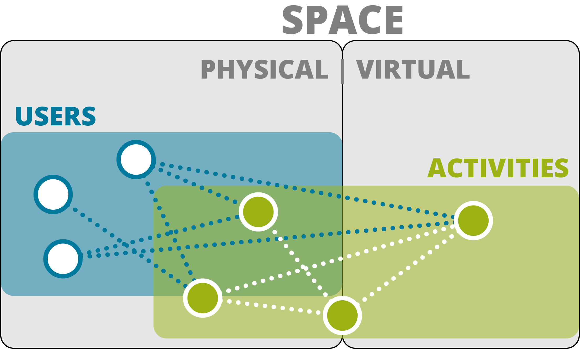
All users exist in some physical space regardless of actual presence. They engage in activities alone and together which take place in physical space, virtual or both.
How might interface thinking transform spatial design?
Looking back at the opening quote of this article, we should extend that question to ask ourselves “What if the worlds largest spatial experience company didn’t build any spaces?”
If we accept that technology and mobile applications are a powerful disruptive tools –capable of completely transforming activities and transactions or creating entirely new experiences– then we should examine some of the modes by which they operate. Let us look at several features of modern application interfaces and consider how they could relate to spatial design.
On Demand
Applications
Technology is increasingly moving in the direction of on-demand applications and services. This is one of the key features of transformative companies which have disrupted industries with their focus on the interface. The interface allows users to connect to commodities and services so well that it becomes the first and most important layer–one that is always available when needed and fades to the background when the task is finished.
Spaces
Sensate
Applications
Awareness of context and surrounding is a key feature of the best applications and environments. This can be as simple as shifting the tone and color of a screen to reflect time of day or ambient conditions, to more complex location-aware responses. Why present a menu of options for all conditions when the selections can be pre-filtered based on current context? Better yet, why not automatically trigger the correct action?
Spaces
Networked
Applications
One of the features that drives the interface of most apps is their always-on network connections. This means that data can be instantly accessed or pushed to the device to enable interactions. Even the subtlest UI elements can utilize this potent connectivity to drive experience.
Spaces
Targeted
Applications
Most successful applications are highly specific and functional. They focus on streamlining and augmenting the interaction and usability of a specific task or activity. By leveraging that extreme focus, they succeed in transforming the user experience. This is often supported by the combination of contextual data (see Aware) and personal user information.
Spaces
Putting it all together
These are only a few examples of how the features of successful application interfaces can be translated to spaces. Just using the four concepts above, we can begin to see how a framework for a spatial interface might come together. Networked and Sensate concepts are closely linked as together they enable spaces to track conditions and respond based on contextual understanding of time, environment, and users the same way a mobile application interface can connect to data sources and device sensors. On-Demand and Targeted are also a natural pairing. When spaces serve multiple purposes for different users at the same time, each use should be carefully curated and tailored to the user. Linking apps and spaces can allow for the same kind of customized user experiences by augmenting spatial experience with a rich digital layer. Spatial experience can be defined by both the physical characteristics of a space as well as the functional; intelligent way-finding is one example of how the experience of a space could be tailored to different users to direct them to spaces suited to their exact needs.
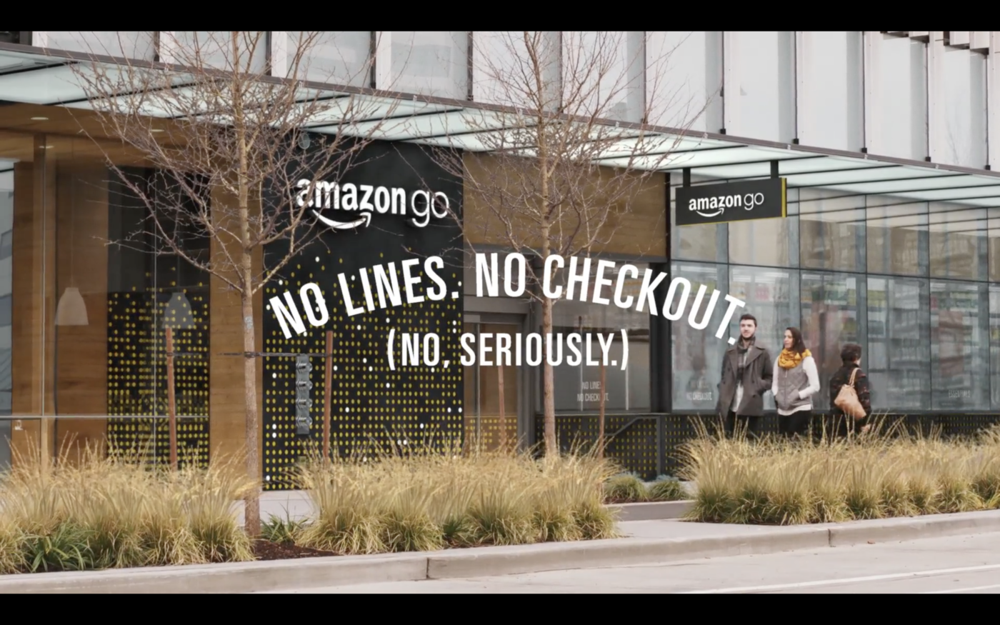
Now let’s look at a real example of this thinking at work, and take note: this is only the first foray into a consumer retail experience for this company. The Amazon go store is the perfect example of interface thinking applied spatially in the context of the built environment. The entire store is built around a transformative and tech-mented (technologically augmented) shopping experience, which all takes place seamlessly behind the scenes. The experience of going grocery shopping has been reduced to its most essential; you forage and gather and return to your hearth. The entire store is sentient and capable of understanding who is interacting with what elements.
And this is only the beginning. Since the entire inventory and manifest of the store is locationally and individually aware, you can imagine the series of digitally augmented experiences which could be layered on the space. While one user simply wants to scan their phone as they enter, browse for items and leave, another user might curate a digital grocery list and ask for a specific, efficient route to collect all their items. The third user in this scenario will do the same thing they already do, which is order a list of items and have it delivered to their doorstop within a few hours with Amazon’s existing services.
