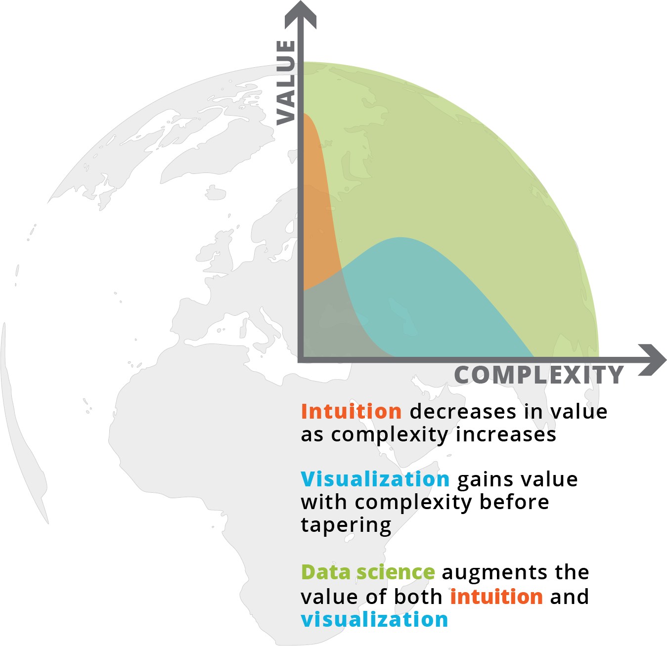
What is spatial intelligence?
For our purposes, it is data related to location. Spatial intelligence is applicable to any scale, from a room or a building to a city or a planet, and may range from the occupancy information of a single workstation to one’s global web of social-media connections. Human beings have amazing spatial intuition (we inhabit a range of spaces daily). But today’s plethora of data from devices and systems allows for even greater spatial understanding, with digital tools and scalable algorithms—including machine learning—allowing us to execute ever-more complex analyses and visualizations on the information. To demonstrate our point, we’ve leveraged these resources to show the process applied to an example question: Where might Amazon situate its second North American headquarters?
What does our intuition say?
Let us begin with intuition. We distributed an internal survey to over 100 of our practice area leaders and to members of our Cities + Sites group. Below are the results, with the answers based on each respondent’s personal metrics, experiences, and gut intuition.
Geo-spatial data mapping
Our next step was to apply data insight to the problem. We started with a series of demographic variables tied to regions in the continental U.S.
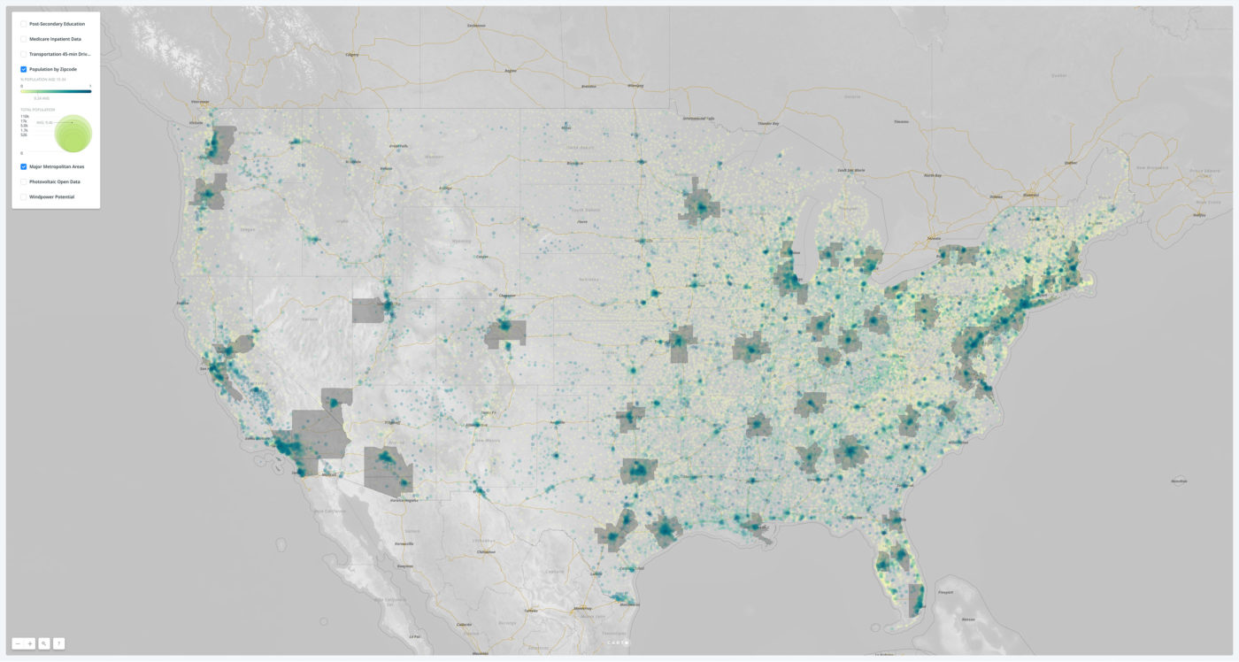
A map of the popoulation by concentration. The color heat map reflects the percentage of population in the 15-34 age range, which is likely talent pool for Amazon’s futuer needs. The gray regions represent the major Metropolitan Statistical Areas (MSAs) that are the potential respondents to the RFP. The background map highlights major road and rail corridors.
A map of major transportation networks. Based on the Amazon RFP, we have drawn an isovist region around major international airports, marking what would be a 45-minute drive. Using centroid data of major road segments, we have also calculated a relative metric for the strength of the primary road network in each region, rendering the results as a heat map.
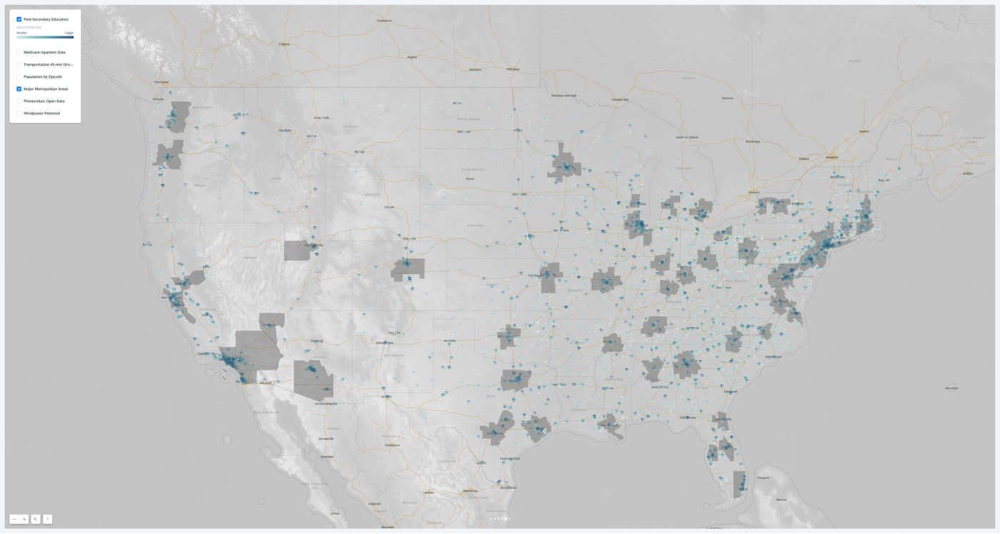
A map of post-secondary educational institutions in the U.S., compiled the U.S. government. The heat map depicts the relative size and scale of each institution.
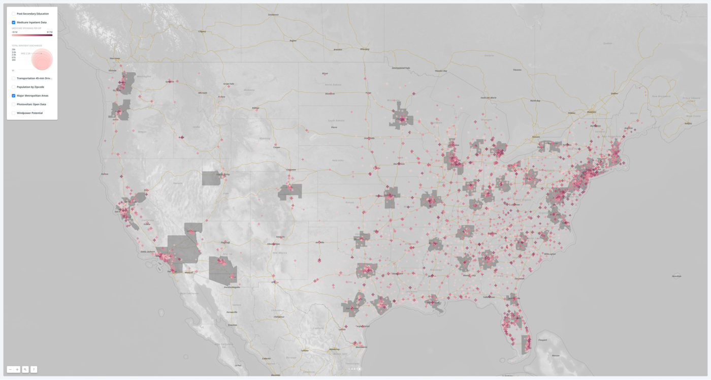
A map of Medicare spending by zip code. While this metric can be problematic for analyzing public health, it is a comprehensive measurement employed here lossely as a proxy for healthcare use.
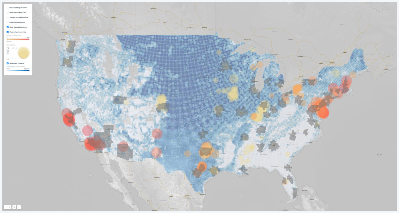
A map of the alternative energy sources. Included is near-term, wind-power-generation potential based on atmospheric data as well as the annual production of photovoltaic energy as tracked by an open-data government project.
These data visualizations confirmed many things we knew, plus affirmed some things we suspected. The U.S. population—as well as younger Americans—are concentrated in major metropolitan areas, with smaller college towns as outliers. These urban areas feature dense transportation networks around major airport hubs. The Midwest’s open plains offer great opportunity for wind-power generation, while current (well-tracked) solar installations remain most effective in the Southwest and in the super-MSA that is the Northeast.
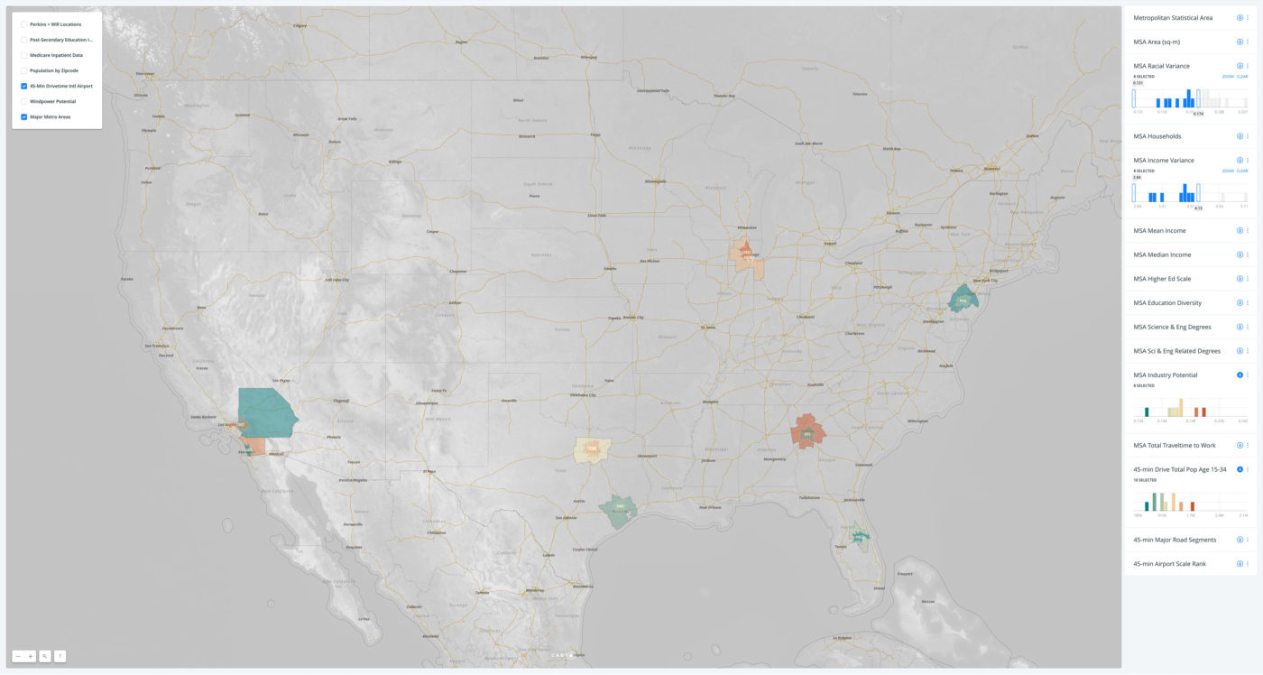
For our next step we took our nationwide dataset and broke it down to the areas of focus—MSAs and regions within a 45-minute drive of an international airport. For each MSA, we included a broad series of demographic indicators such as age, ethnicity, education, employment, commuting time, commuting methods, and migration patterns.
Interactive data analysis
For our first exercise we combined multiple variables into single metrics so that we could visualize differences between areas. Next, to reinforce our core belief in maintaining diversity, we calculated the variance across several indicators of race, income, and education. We figured out the total percentage of white-collar jobs in each MSA, as that could hint at poachable talent and existing business infrastructure. Finally, we spatially intersected our MSA regions with other more granular datasets, aggregating information about road density; wind-power potential; post-secondary education levels; and average and total Medicare discharges and spending.
The resulting interactive map is embedded below. You can use it to explore the subsets of data by filtering and visually heat-mapping variables, both singularly and in combinations. Here is a sample analysis using the mapping abilities.
To start, we filtered out MSAs that had over 4 million households; this removed the New York MSA, an extreme outlier. We heat-mapped each transportation region by the size of its airport (a lower rank menas a larger facility) and each MSA by its total aggregate commute time.
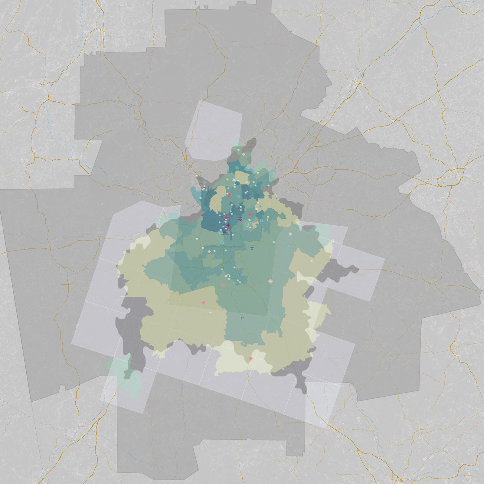
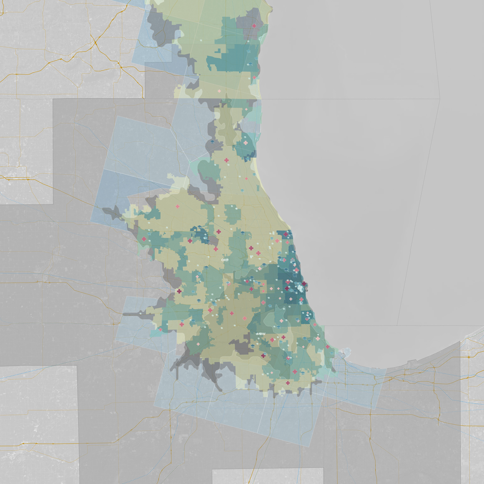
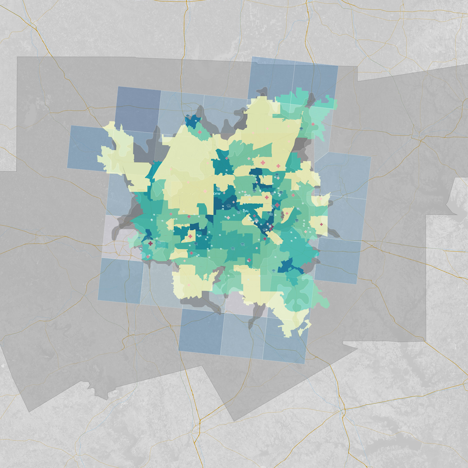
We filtered for a diversity of incomes and races; we also heat-mapped the percentage of white-collar jobs and the amount of inhabitants aged 15-34. Based on this data, Dallas and Chicago both looked promissing, as did Alanta.
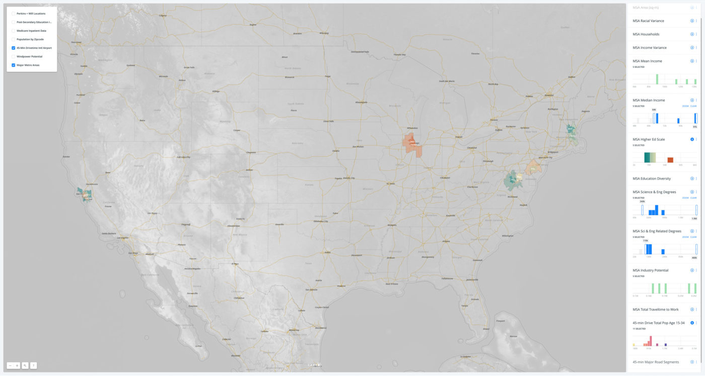
We looked at MSAs with median incomes higher than the national average and with grater numbers of residents holding science or engineering degrees. We still heat-mapped for the 15-34 demographic and for the overall scale of the MSA’s post-secondary institutions. Within this set, Philadelphia, Boston, and suprisingly, Washington DC, showed strongly.
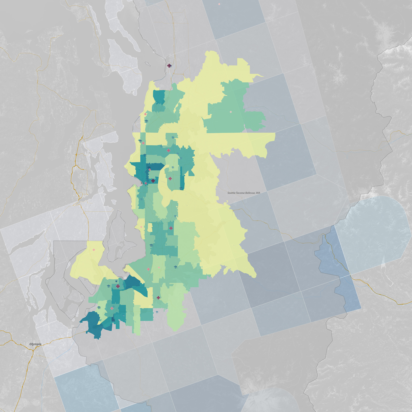
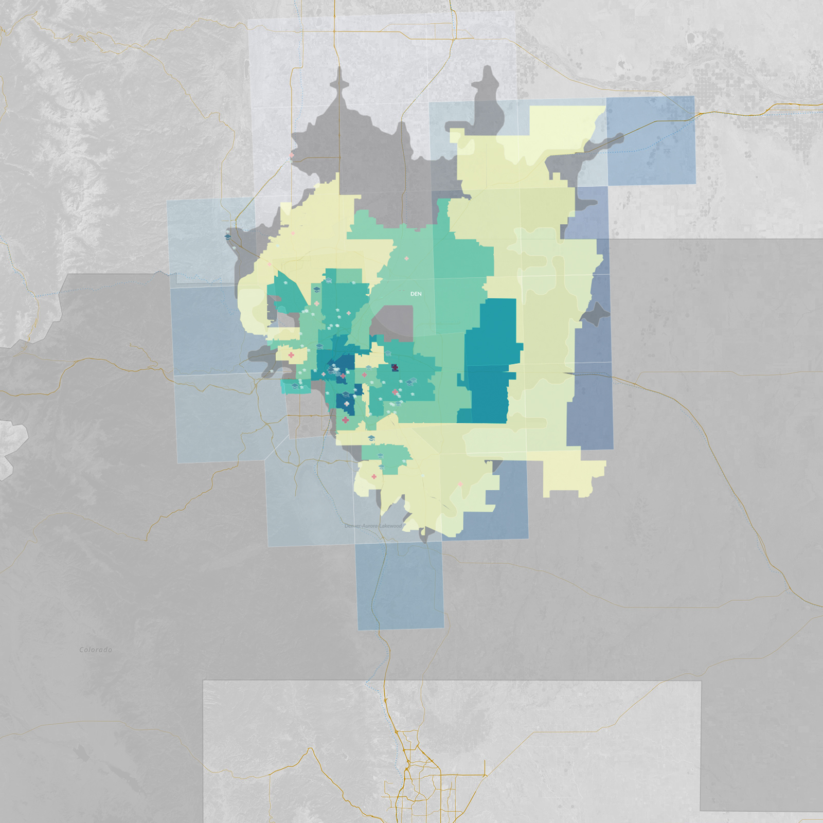
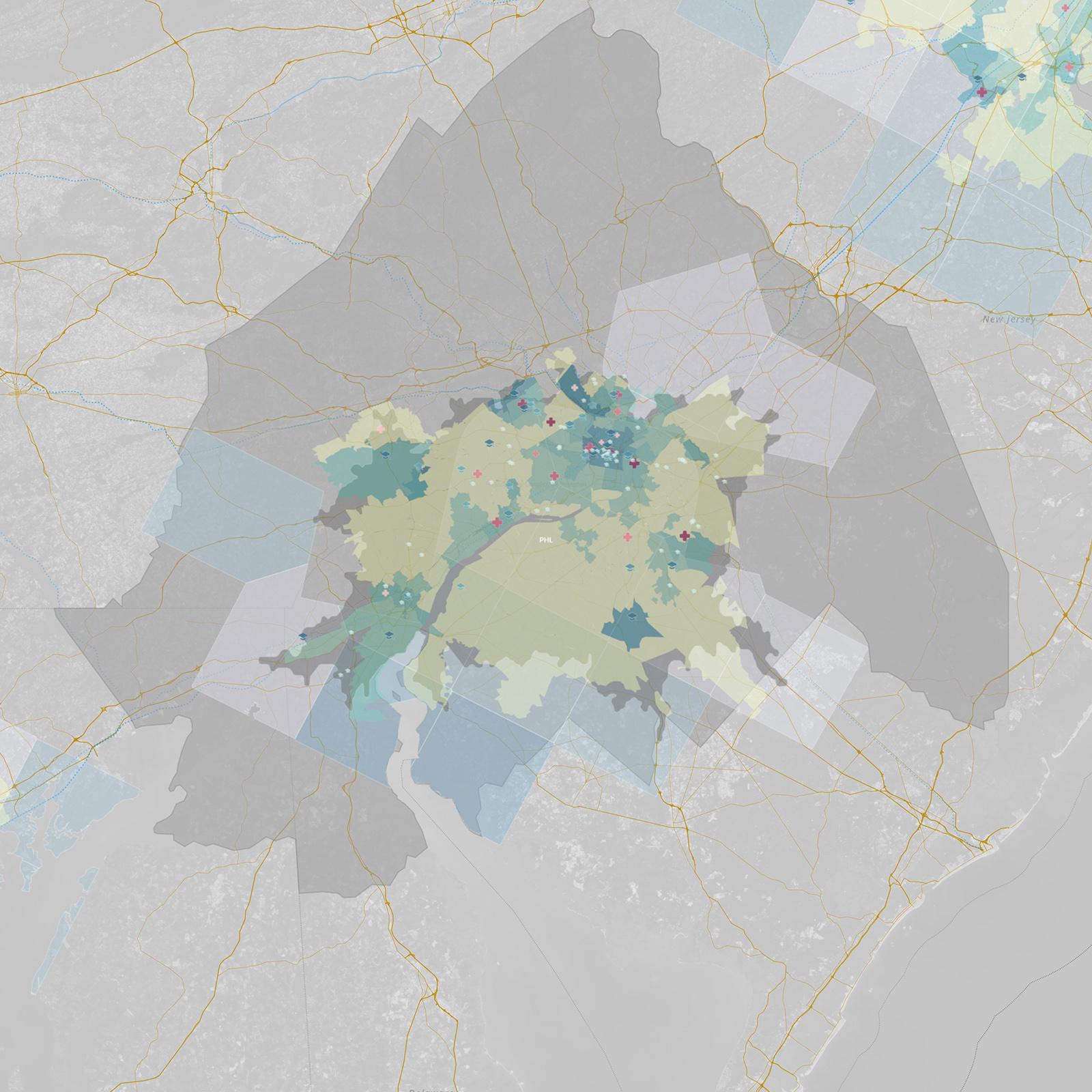
The advantage of our method is that we can easily intersect multiple variables, turning the sets of data on and off as we need them. This allows us to highlight and understand the underlying differences between the MSAs, viewing the results visually in interactive maps. Amazon is using its impact and success in Seattle to craft the parameters of its RFP for a second headquarters and we can visually compare their current home against other potential cities.
Below is a closer look at the Seattle MSA with all the data layers visible. We can visually contrast what we are seeing here with other MSAs of interest, including those from Atlanta, Chicago, Dallas, Denver, and Philadelphia:
Interactive map: What do you see?
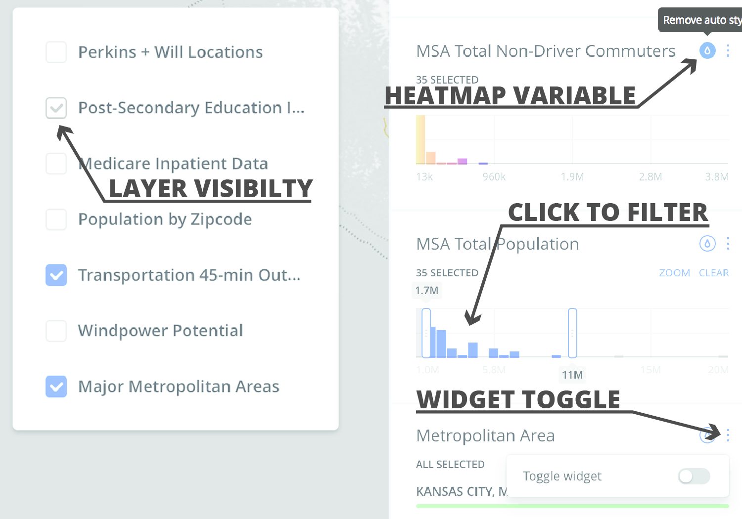
Below is the interactive map that you can explore and use to draw your own insights (note: embedded map disabled by default on mobile). You can scroll through variables on the right and toggle widgets to show and hide data. Each variable’s histogram reveals its distribution of data over a period of time. Adjust layer visibility and heat-map variables to style the map, and then filter via ranges to subset data.
Click and drag to pan and use -/+ buttons to zoom in and out. Holding Shift + Left Mouse dragging a box will zoom to region.
Applying advanced data science
We hope we have demonstrated how we can harness and analyze public data to produce insights, information that we then can map in visual, interactive ways. We can draw from a wide range of census info, research conducted by government agencies, and even satellite imagery. By choosing and blending specific variables, we also can target complex goals such as diversity and sustainability.
Our process provides great possibilities. However, selecting and modifying each variable can be time-consuming. Enter machine learning, a branch of data science that uses algorithms that become progressively smarter with each iteration. These algorithms perform at scale; they also allow users to add additional variables and produce increasingly detailed results, all in a time-efficient way.
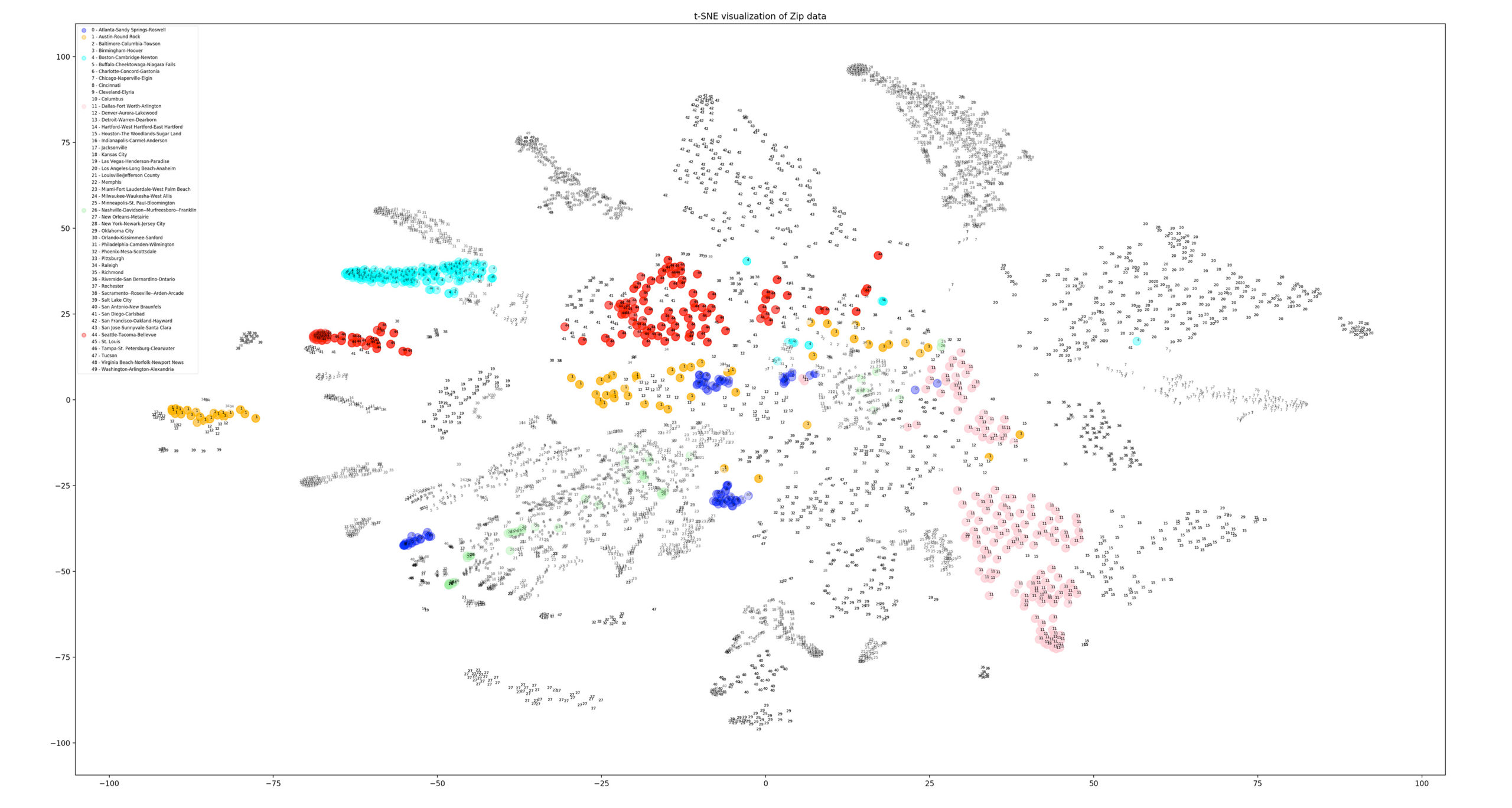
Machine learning allows to get more granular, incorporating 203 individual data points for each of the 8,136 zip codes that spatially intersected one of our 53 MSAs. We also took the 17 variables that we aggregated via spatial intersects or calculated as a variance of demographic indicators for race, income, and education. (See the full list here.) Having now amassed 1,652,509 data points, we utilized a method of dimensionality reduction known as t-distributed Stochastic Neighbor Embedding to cluster this high-dimensional data; we also opted for a distribution built on Principal Component Analysis, another means by which to direct an analysis to its most meaningful variables.
Our aim was to group like zip codes based on all of 220 variables we provided. To do so we selected the data that we wanted the algorithm to operate upon, but we did not specify the combinations or weighting that should be used to reduce the data’s dimensions into a 2D field of points. It was an example of unsupervised machine learning, and here are the results.
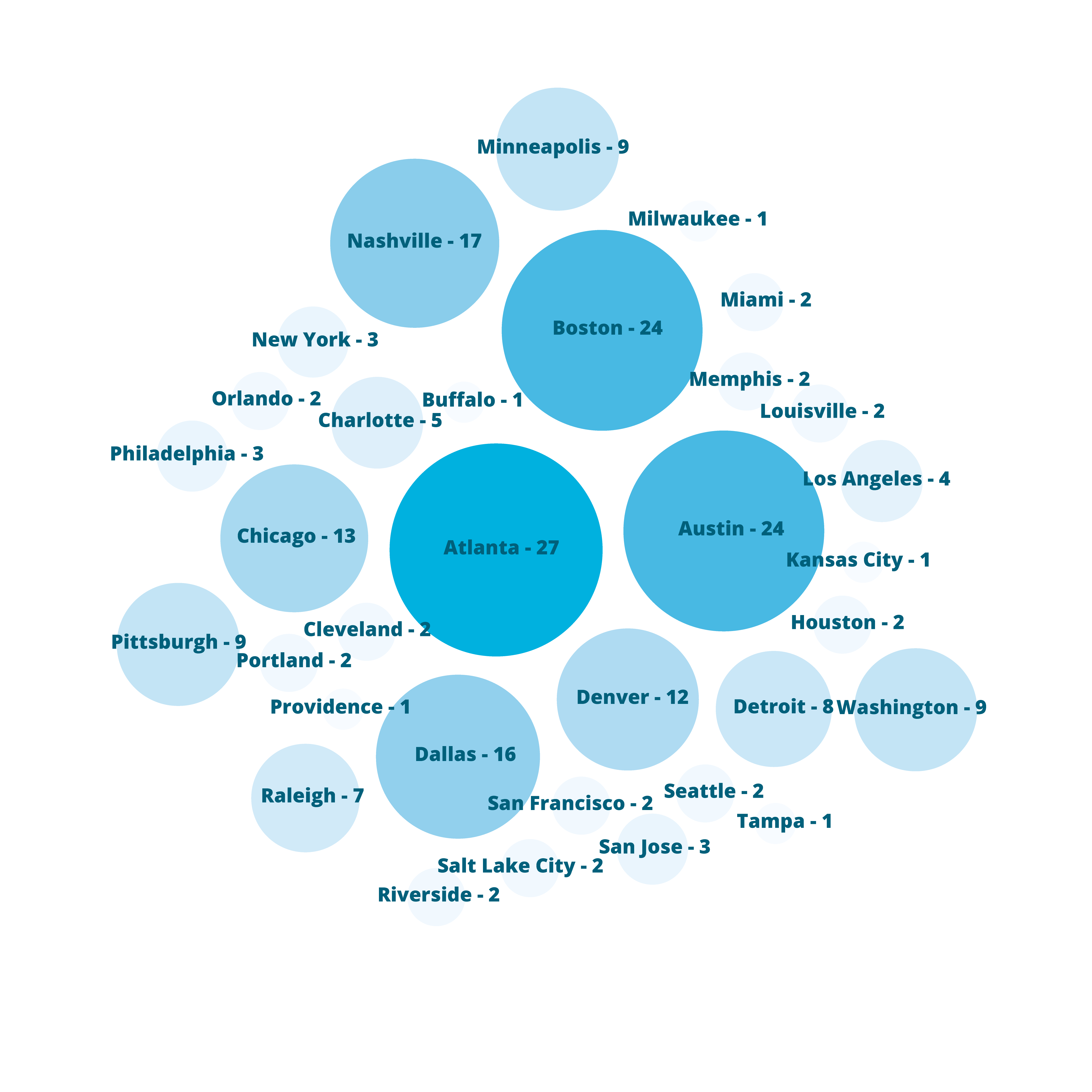
Intuition and data science
The MSA data led to regionally linked zip codes clustering together. Many jumbled together in the center of the graphic, with radial clusters for other grouped or individual MSAs. We also had a distribution and mingling of zip codes into separate clusters or regions.
To underscore our findings, we have color coded the plot to show the Seattle MSA zip codes alongside those of the top 5 responses in our initial Amazon survey. Austin (orange) and Boston (cyan) were relatively well-aligned with Seattle (red); Atlanta (navy) was separated into four distinct and tight groupings, two of which were close to the bulk of Seattle. Dallas (pink) started near the center but grew out in a totally different direction; Nashville (green) was scattered across a region between the Atlanta groupings.
These findings suggested that the top survey responses of Austin and Boston were solid options. However, Atlanta appeared to be more (data) segregated than the two Seattle clusters, while Boston was more densely grouped than they were.
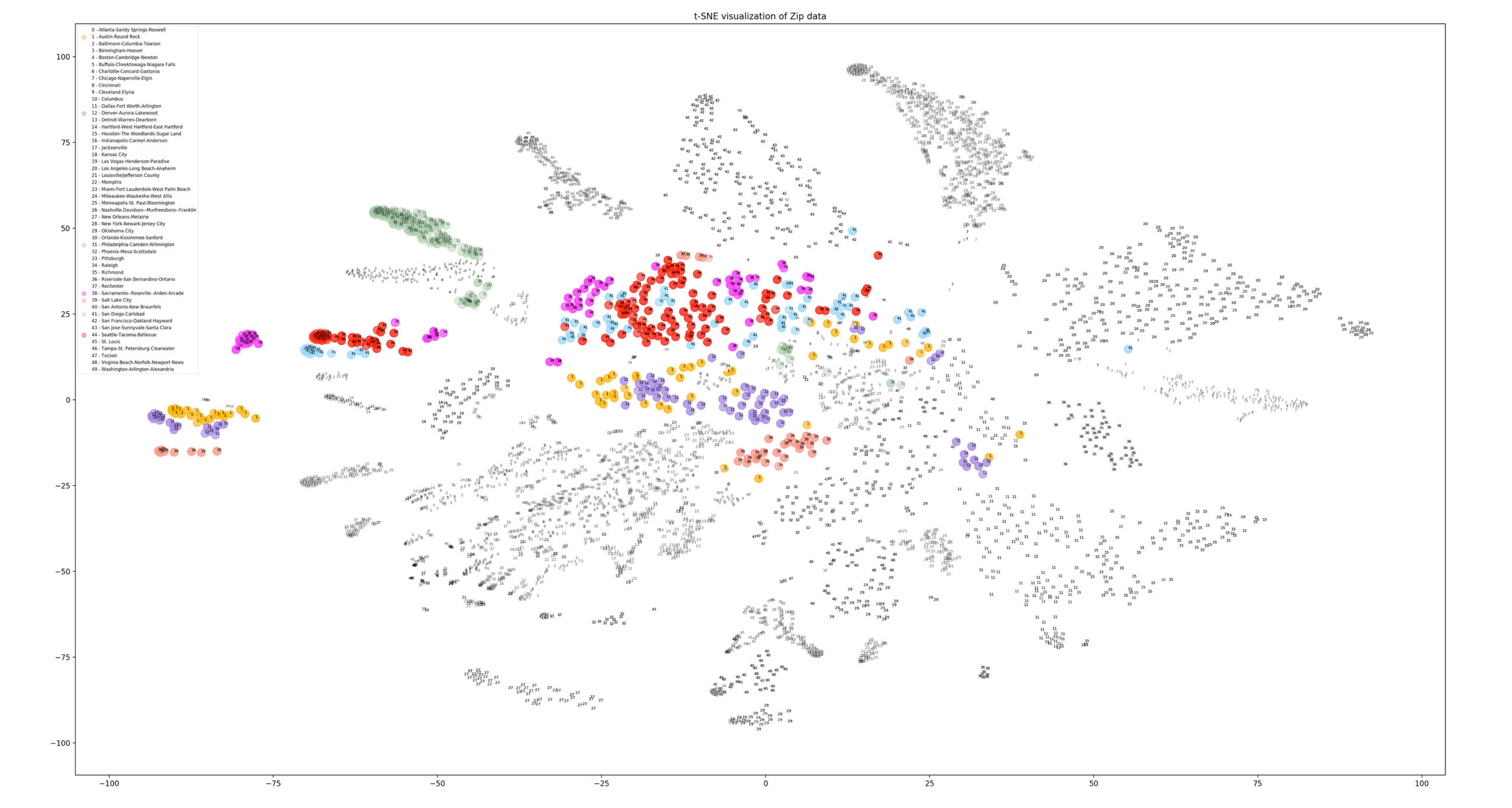
Best fit(s) using data science method
For the final step, we looked at the most similar MSAs within this clustering analysis. This methodology showed that Sacramento (pink) and San Diego (blue) were actually very similar in distribution to Seattle (red). Denver (purple) and Salt Lake City (peach) joined Austin (orange) as the closest fit from the original survey. Philadelphia (green) was also a potential contender, aligning much like Boston did in the previous graphic.
What did we learn?
We hope this article has increased your knowledge of spatial intelligence, showing how we can leverage new tools to analyze and present location data. To summarize this exercise, we began with a survey of our experienced designers and planners to see what their intuition said. We collected and organized publicly available data and then embarked on a mapping expedition to interpret and visually present the parameters of the Amazon RFP. Finally, we utilized machine learning to analyze 220 different variables from each potential city and its zip code sub-regions. Sacramento and San Diego shared the most similarities with the Seattle market, but Austin—our survey’s second most common response—was also well-supported by our analysis. The principles exhibited here can be applied to many potential projects and investigations.
Intuition
When we tallied the results from the 100+ global professionals we surveyed as part of our first-step gut-check, Atlanta, Austin, and Boston came out as the top contenders for the second Amazon headquarters. The decisions were not based on scientific measures, but rather on intuition and on-the-ground experience.
Visual Mapping
These interactive visualizations aggregated common demographic indicators to compare relative diversity. Data for additional layers was mined from public education, healthcare, and energy records. This technique allowed for visual comparisons of MSAs against Amazon’s existing location in Seattle.
Data Science
We used machine learning to analyze 220 variables across over 8,000+ zip codes, identifying cities that were similar to Seattle in composition and breakdown. Sacramento and San Diego were the best fits, but Austin and Denver were not far behind. Data science allows for complex analysis using machine cognition.
Pros:
Excellent at capturing intangibles quickly and freely. Useful to apply at every stage in a process.
Pros:
Maps and visual analysis allow users and stakeholders to “see” more complex relationships in a scale-free environment.
Pros:
Allows for complex analysis of hundreds/thousands of variables with efficient processes.
Cons:
Hard to apply at large scale and complexity. At a minimum requires validation.
Cons:
Limited ability to compare variables against one another. Blending variables creates a layer of abstraction.
Cons:
Difficult to communicate to a lay-audience. Requires many steps of iterating/testing and requires clean data to operate.
Sources:
- 5yr American Community Survey Estimates: www.census.gov
- 2013 IPEDS Post-Secondary Institution Data: www.data.gov
- Medicare Inpatient Spending Data: data.cms.gov
- National Renewable Energy Lab Wind Prospector: www.nrel.gov
- NREL OpenPV Project: openpv.nrel.gov